Examining Redlining in the U.S. with fivethirtyeight Data
This is an expansion on a school project I did in the summer of 2022 (in pursuit of my MS in Data Science) about redlining in the United States, a practice used in the early- to mid-20th century that prevented investment in areas that were deemed hazardous or otherwise not suited for financial support. The effects of redlining persist today. All data originally comes from the 2020 United States Census, which was cleaned and made available by fivethirtyeight (see link below).
Introduction and Preprocessing
To access and prepare the data for use, follow these steps.
Step 1: The dataset on redlining in the United States can be accessed via this permalink: https://github.com/fivethirtyeight/data/blob/b22a21b264162ad0b5d8954b02e0bca5ab782113/redlining/metro-grades.csv
Step 2: Because of inconsistency with the csv file format, it is important to select the “copy” option from the page and paste the data in a new Excel file, rather than attempting to read the csv from the website directly into RStudio. The main reason for this is that the csv file on the website compresses all the data into a single column, which is easy to deal with in Excel.
Step 3: The data will be copied as a single column rather separated into a properly formatted table. If this occurs, the steps below can organize the data into tabular form.
3a. In Excel, first do a “Find and Replace” for the character string “, “ (note the space) and replace with “-“. This is necessary because the first column contains a city followed by a state, separated by a comma, and we do not want to separate the city and state into distinct columns.
Step 3b: Highlight column A and select “Text to Columns” in the Data tab at the top of the page.
Step 3c: Follow the prompts, choosing to delimit the data by comma.
Step 4: Save the csv file locally and copy the file path for importing into RStudio. The code for importing into RStudio is as follows, with the column classes explicitly laid out. Note that the file path given is local to my computer, and it will need to be updated when saved in a different location.
options(scipen = 7)
par(mfrow=c(1,1), mar=c(5.1, 4.1, 4.1, 2.1),oma=c(0,0,0,0))

redlining <- read.csv([FILE PATH])
colClasses <- c("character", "character",
                "integer", "integer", "integer", "integer", "integer", "integer",
                "numeric", "numeric", "numeric", "numeric", "numeric",
                "numeric", "numeric", "numeric", "numeric", "numeric",
                "integer", "integer", "integer", "integer", "integer",
                "numeric", "numeric", "numeric", "numeric", "numeric")
This dataset includes some sociological terms that may be unfamiliar. Those include:
Diversity Index: The probability of randomly selecting two people of different races from a given area. Values closer to 1 indicate a more diverse area.
HOLC Zones: Geographic areas described by the Home Owners’ Loan Corporation based on an early census of the United States. Each zone was given a “grade” of A: “best” (green), B: “Still Desirable” (blue), C: “Definitely Declining” (yellow), D: “Hazardous” (red).
Location Quotient: A measure of over- or under-representation in a given area for a given racial/ethnic group. Values larger than 1 indicate that the racial group is over-represented in that area.
Analyzing Zones with High and Low Diversity
An important figure in this work is Diversity Index, which is the probability of randomly selecting two people of different races from the given area. In the Redlining dataset, the population is broken into the following racial categories: White, Black, Hispanic, Asian, and Other. I will calculate my own Diversity Index for each zone using the formula:
DI = 1-P(Same Race) = 1-P(2 White ∪ 2 Black ∪ 2 Hispanic ∪ 2 Asian ∪ 2 Other)
Then, I will classify the diversity index of each zone as being “more diverse” or “less diverse” than the overall United States Population, which, as of 2020, is 61.1%.
So, to analyze the diversity index for each zone, I created two new variables: Diversity Index [numeric, quantitative continuous] and More/Less Diverse [character, nominal categorical].
The code excerpt below shows the process I followed in R to label each zone as “more diverse” or “less diverse” than the overall U.S. population according to the Census.
diversity_indices <- c() #empty vector to store DI
more_or_less_diverse <- c() #empty vector to store more/less DI than 61.1

for (x in 1:length(redlining$total_pop)) {
  #probability of selecting 2 white people in a row
  P2W <- (redlining$white_pop[x] * (redlining$white_pop[x] - 1))/
    (redlining$total_pop[x] * (redlining$total_pop[x] - 1))

  #probability of selecting 2 black people in a row
  P2B <- (redlining$black_pop[x] * (redlining$black_pop[x] - 1))/
    (redlining$total_pop[x] * (redlining$total_pop[x] - 1))

  #probability of selecting 2 hispanic people in a row
  P2H <- (redlining$hisp_pop[x] * (redlining$hisp_pop[x] - 1))/
    (redlining$total_pop[x] * (redlining$total_pop[x] - 1))

  #probability of selecting 2 asian people in a row
  P2A <- (redlining$asian_pop[x] * (redlining$asian_pop[x] - 1))/
    (redlining$total_pop[x] * (redlining$total_pop[x] - 1))

  #probability of selecting 2 other people in a row
  P2O <- (redlining$other_pop[x] * (redlining$other_pop[x] - 1))/
    (redlining$total_pop[x] * (redlining$total_pop[x] - 1))

  #sum these probabilities to find the probability of selecting
  #two people of the same racial classification in a row
  prob_same_race <- P2W + P2B + P2H + P2A + P2O

  #diversity index is the complement
  di <- 1 - prob_same_race

  #store in diversity indices vector
  diversity_indices[x] <- di

  #store in less/more vector
  if (di < 0.611) {
    more_or_less_diverse[x] <- "less"
  }
  else {
    more_or_less_diverse[x] <- "more"
  }
}
Now, we have a new binary variable illustrating the Diversity Index of each zone, which is named more_or_less_diverse
A barplot of these Diversity Indices is shown below, giving a preliminary look at whether it is common for a zone in the U.S. to have a lot of racial diversity.
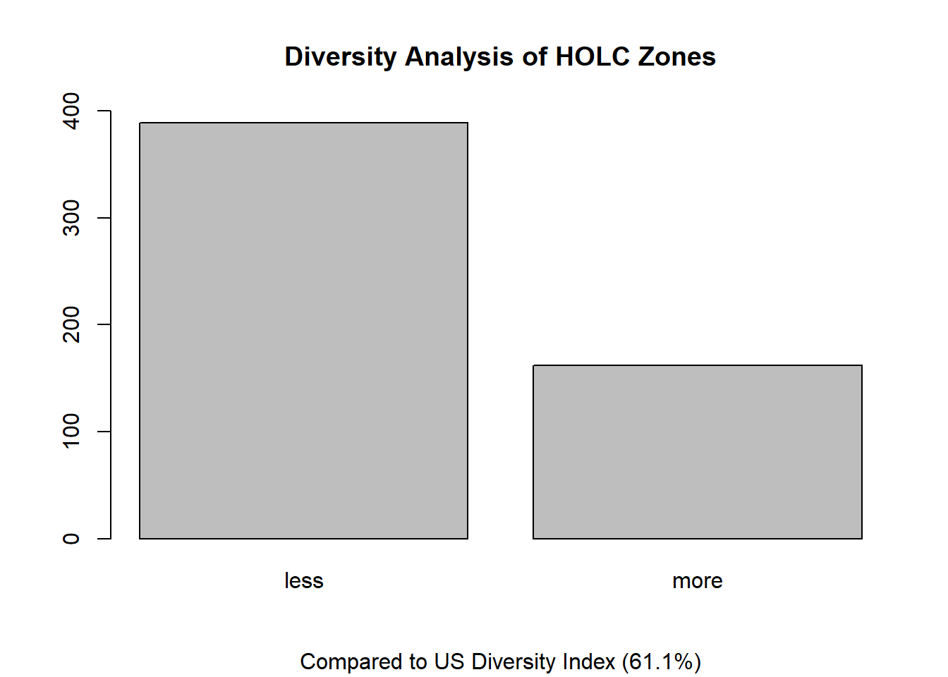
Far more HOLC zones in the dataset are less diverse than the total US diversity index, which indicates that while the country overall is quite diverse, individual areas remain segregated. We hear this anecdotally quite often, as racial divides are often the basis for redistricting (and gerrymandering) of electoral maps. Still, the number of zones that are considered more diverse is close to 30%, which is certainly large enough to be meaningful, and it would be interesting to examine the trend of this percentage from census to census, a task that is beyond the scope of this analysis.
Analyzing Zones by Percentage of Racial Groups
For this analysis, I wanted to examine and compare histograms of the percentages of racial groups per zone. I will exclude “Other” to focus more on those who selected one of the most common racial groups in the census. Each zone in the dataset has a measurement for people identifying as White, Black, Hispanic, and Asian, which is calculated as both a count and as a percentage.
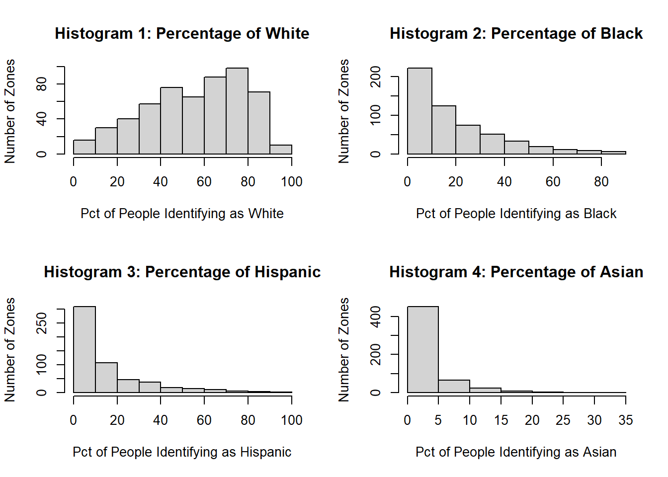
There are two main takeaways from these histograms. First, there is a high proportion of zones in the country that are overwhelmingly white, and there are very few zones that are overwhelmingly any other race, which indicates that many zones remain highly segregated. Second, the heavy right skew of histograms 2-4 shows that the many segregated zones are likely dominantly White. So if you do not identify as White and you live in one of those zones, it is likely that your schoolmates, school teachers, co-workers, and neighborhoods will all be White, which is a problem of representation.
Further, it seems that White people have greater choice in the United States if they want to live in racially segregated areas, which may perpetuate harmful trends of exclusion and unequal opportunities. We often hear about people moving so that their children can have access to better schools, which can be coded language for dominantly White areas.
Location Quotient by Race
The dataset classifies each zone with a grade of A, B, C, or D. According to the documentation, this grade signifies the desirability of the zone based on the Home Owners’ Loan Corporation’s metrics, with A: “best” (green). B: “Still Desirable” (blue). C: “Definitely Declining” (yellow). D: “Hazardous” (red). For this analysis, I wanted to see how the percentage of racial groups changes by HOLC grade. A helpful metric for this is the Location Quotient, a factor that describes the over- or under-representation of a racial group in a given zone. This dataset contains Location Quotient data for each zone and for each racial group, with values smaller than 1 signifying under-representation of the racial group within the zone and values larger than 1 signifying over-representation.
I will make plots for each grade based on the subset of the original dataset containing only that grade. For example, I will make a subset of each zone classified with a grade of A. Then, I will plot the average Location Quotient for each racial group in a side-by-side bar graph and compare the plots.
####HOLC Grade of A####
subsetA <- subset(redlining, redlining$holc_grade == "A")
avg_lq_white <- mean(subsetA$lq_white)
avg_lq_black <- mean(subsetA$lq_black)
avg_lq_hisp <- mean(subsetA$lq_hisp)
avg_lq_asian <- mean(subsetA$lq_asian)
avg_lq_other <- mean(subsetA$lq_other)

avg_lq_A <- c(avg_lq_white, avg_lq_black, avg_lq_hisp, avg_lq_asian, avg_lq_other)
names(avg_lq_A) <- c("White", "Black", "Hispanic", "Asian", "Other")
####
####HOLC Grade of B####
subsetB <- subset(redlining, redlining$holc_grade == "B")
avg_lq_white <- mean(subsetB$lq_white)
avg_lq_black <- mean(subsetB$lq_black)
avg_lq_hisp <- mean(subsetB$lq_hisp)
avg_lq_asian <- mean(subsetB$lq_asian)
avg_lq_other <- mean(subsetB$lq_other)

avg_lq_B <- c(avg_lq_white, avg_lq_black, avg_lq_hisp, avg_lq_asian, avg_lq_other)
names(avg_lq_B) <- c("White", "Black", "Hispanic", "Asian", "Other")
####
####HOLC Grade of C####
subsetC <- subset(redlining, redlining$holc_grade == "C")
avg_lq_white <- mean(subsetC$lq_white)
avg_lq_black <- mean(subsetC$lq_black)
avg_lq_hisp <- mean(subsetC$lq_hisp)
avg_lq_asian <- mean(subsetC$lq_asian)
avg_lq_other <- mean(subsetC$lq_other)

avg_lq_C <- c(avg_lq_white, avg_lq_black, avg_lq_hisp, avg_lq_asian, avg_lq_other)
names(avg_lq_C) <- c("White", "Black", "Hispanic", "Asian", "Other")
####
####HOLC Grade of D####
subsetD <- subset(redlining, redlining$holc_grade == "D")
avg_lq_white <- mean(subsetD$lq_white)
avg_lq_black <- mean(subsetD$lq_black)
avg_lq_hisp <- mean(subsetD$lq_hisp)
avg_lq_asian <- mean(subsetD$lq_asian)
avg_lq_other <- mean(subsetD$lq_other)

avg_lq_D <- c(avg_lq_white, avg_lq_black, avg_lq_hisp, avg_lq_asian, avg_lq_other)
names(avg_lq_D) <- c("White", "Black", "Hispanic", "Asian", "Other")
####

#combine into matrix
avg_lq_matrix <- cbind(avg_lq_A, avg_lq_B, avg_lq_C, avg_lq_D)
rownames(avg_lq_matrix) <- names(avg_lq_A)
colnames(avg_lq_matrix) <- c("A", "B", "C", "D")
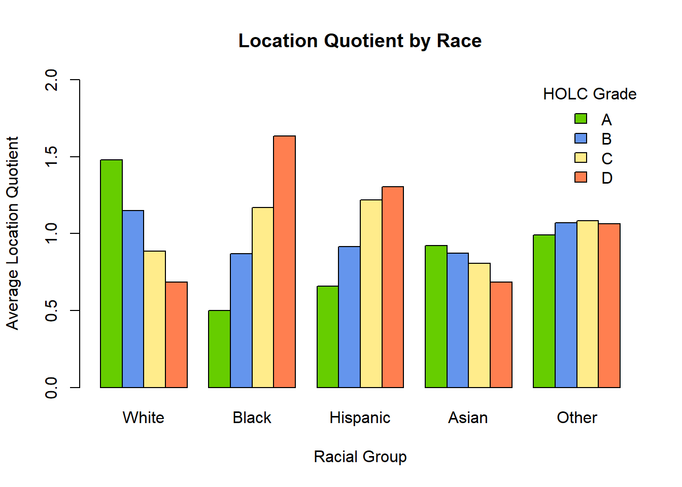
This plot is a stark illustration of the effects of redlining in the United States. To summarize, if you are White, you are much more likely to be overrepresented in a zone with grade A. If you are Black or Hispanic, you are much more likely to be overrepresented in a zone with grade D. The process of redlining in the early- to mid-20th century essentially created neighborhoods that were permissibly segregated, with nonwhite people forced out of homes and denied access to homes within certain geographic areas (which were demarcated on city maps using actual red lines, hence the name). We see the effects of this process today. The neighborhoods that received lots of funding and attention in their development in postwar US cities became the zones graded A in the most recent census. Since nonwhite people were denied access to these areas, we see a large overrepresentation of White people in these areas, which contributes to racial inequity and unequal access to resources.
It is important to remember that the HOLC grade of D signifies “Hazardous” and not just “Undesirable.” This dataset reveals that, not only are Black and Hispanic people more likely to be shut out of desirable communities, they are also more likely to live in hazardous areas, which likely contributes to other poor outcomes in physical health, mental health, education, social mobility, and many others.
There is much more analysis that could be done with these data. I am grateful that fivethirtyeight makes this data so readily accessible for data projects, and I look forward to continuing with it in the future.